Notification Component
What is the Notification component?
Overview
The Notification component will provide your customers with all of the payment-related notifications they need, from within your platform.
Once you embed the Notification component into your platform, your customers will get out-of-the-box payment, onboarding and other transactional notifications, with ready microcopy and relevant CTAs.
Why you should implement this component
-
With a minimal implementation effort, the Notification component provides your customers with a great deal of value in understanding where their payments stand, what events have recently occurred, and how to address them, including redirecting them to the relevant location in your platform. This saves your customers time and gives them full transparency and visibility into their payment solution.
-
Implementing this component saves your team a significant amount of integration time.


What does the Notification component include?
Bell icon
The bell icon is the gateway into the notification center, and is what lets your customers know that they have new notifications.
The bell icon has two states:
- New notifications are available (a bell with a red dot). This means that there are new, unread notification awaiting in the notification center.

- No new notifications (a bell without a red dot). This means that all notifications have been viewed within the notification center.

Notification center
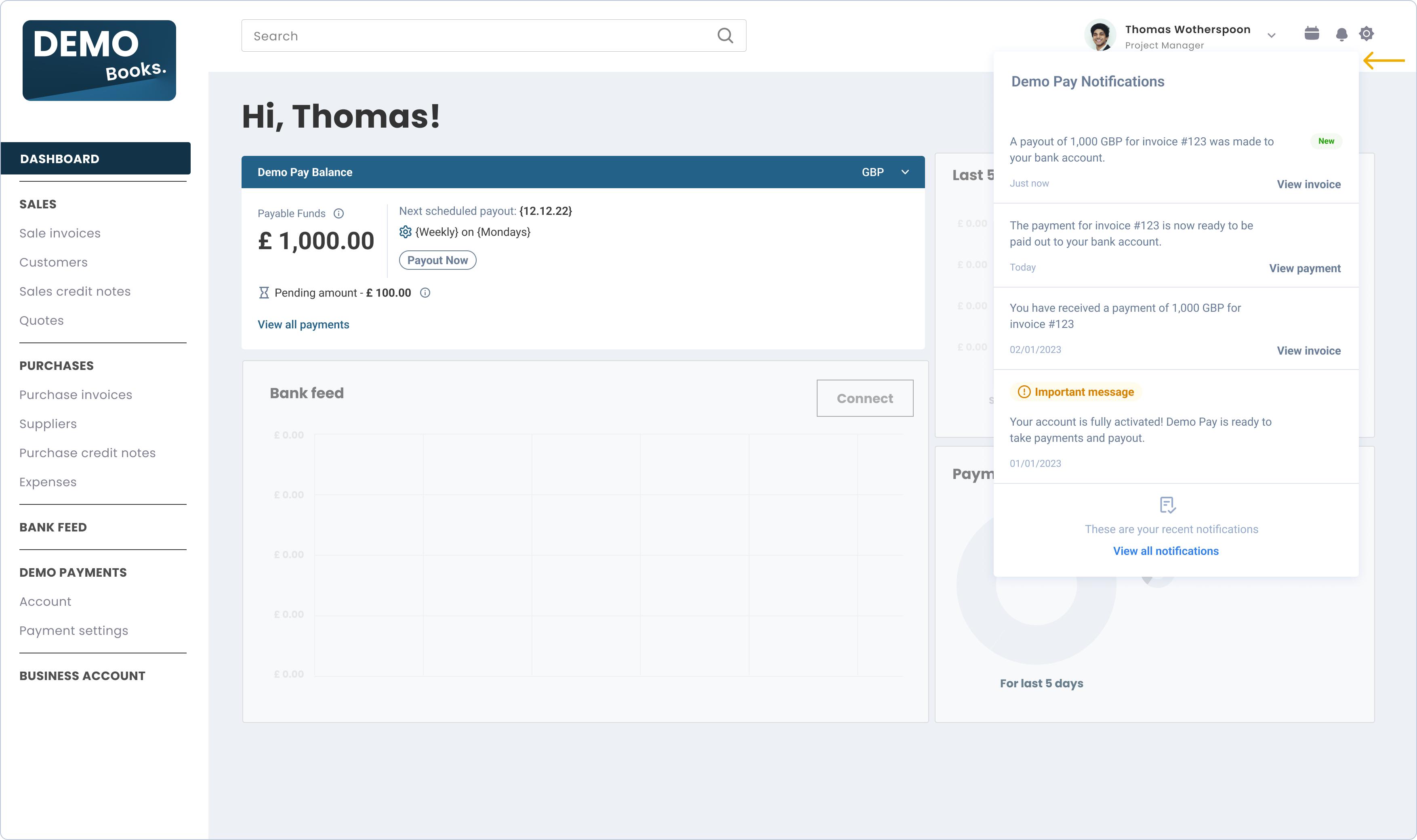
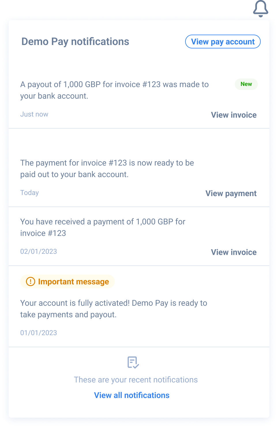
The notification center is the area that opens when your customers click on the bell icon.
It will show a list of the latest notifications, ordered from the most recent to the least.
Each notification will have a text body, a timestamp, a priority indication and, in most cases, an actionable CTA.
Unread notifications will be marked with a "New" indicator.
Component zero state
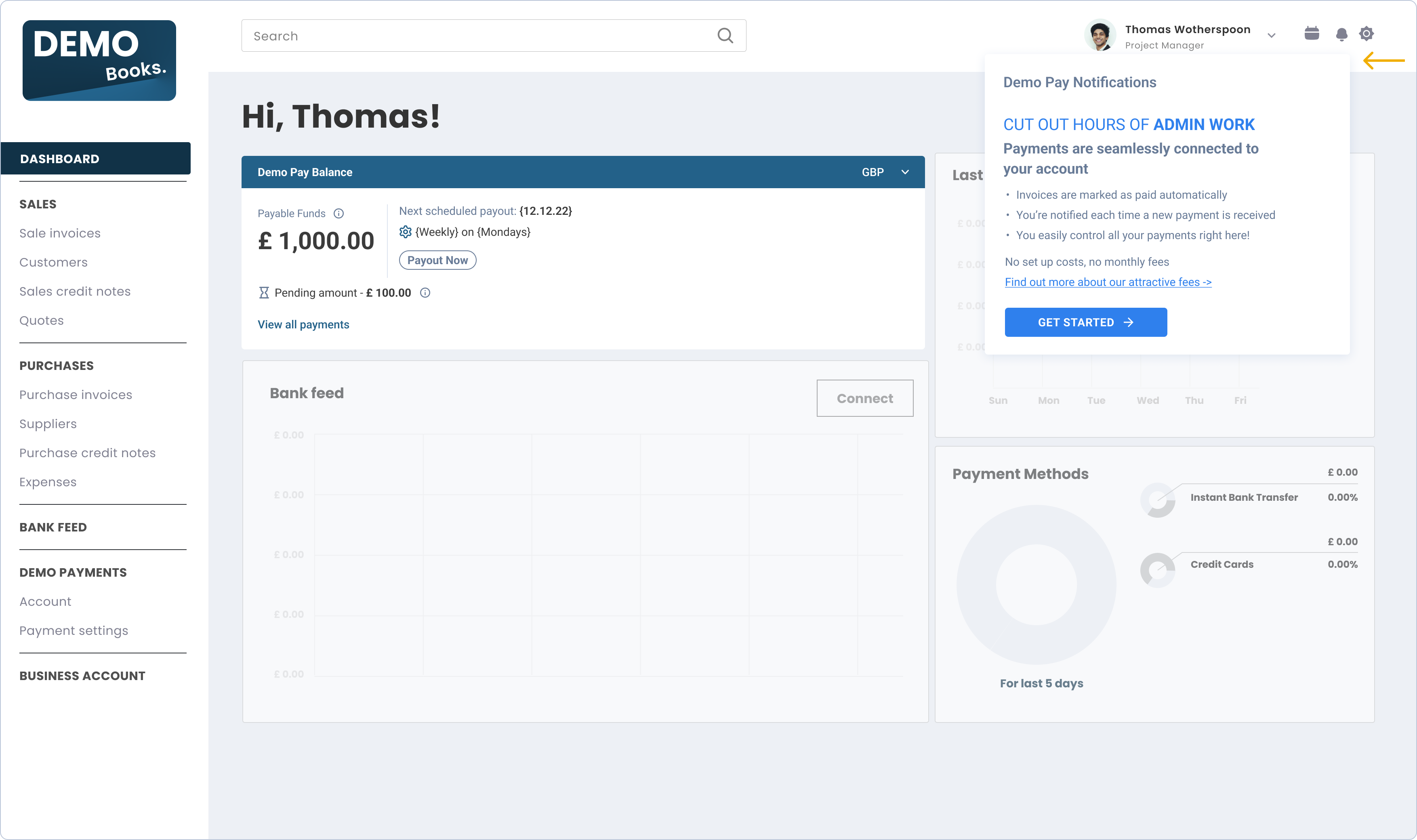
For platform users who have yet to sign up to your payments solution, the Notification embedded component will show in a "zero state" view. This view's goal is to emphasize your payment solution's value and showcase its core features to potential users.
The "zero state" includes a prominent CTA and messages, incentivising your users to sign up to your payments solution. Additionally, it allows users learn more about it.
Triggering the "zero state" view
The "zero state" will automatically trigger once an access token is created without a vendor ID, meaning the user is not registered with UNIPaaS.

Main notification use cases
Onboarding statuses - we will notify your customer upon a change of their onboarding status.
- Example: "Your account is fully activated! Demo Pay is ready to take payments and payout."
Payment statuses we will notify your customers when they receive a payment or can make a payout and help them take relevant actions.
-
Example: "You have received a payment of 1,000 GBP for invoice #123". From here, we will prompt the customer to view this specific invoice.
-
Example: "The payment for invoice #123 is now ready to be paid out to your bank account." From here, we will
prompt the customer to view this specific payment and redirect them when they click. -
Example: "A payout of 1,000 GBP for invoice #123 was made to your bank account." From here, we will prompt the customer to view this specific invoice (for reconciliation purposes) and redirect them when they click.
Where should I implement this component in my product?
The Notification component should be implemented on the top bar of your platform (preferably top-right). It can be placed right next to the user's profile icon (if such exists). UNIPaaS will make sure that wherever it is located, the notification center that opens will be visible and will provide a good user experience for your customers.
Before you begin implementation
-
If you have not set up UNIPaaS Components, please go to the UNIPaaS Components page before moving forward.
-
Allocate the following space for this component:
- Width - 30 pixels.
- Height - 30 pixels.
- Required scopes:
- notification_read
- notification_write
How to implement this component?
To use the Notification component, create an empty DOM node (also known as a container) in your page and give it a unique ID. This will be the place where the Notification component will be mounted. Make sure to assign a unique ID to the container so that it can be easily identified and accessed.
<div id="notification"></div>To use the Notification component, create an instance of it and mount it to the container DOM node in your page. This should be done after the previous div has finished loading. To create an instance of the Notification component and mount it to the container DOM node, you can use the following code:
<script type="text/javascript">
  const config = {
    icon: {
      url: 'https://cdn.unipaas.com/img/bell-icon.svg', //optional
      size: 30 //optional hight & width in px
    }
  }; // UNIPaaS Components Notification config type
  const notification = components.create("notification", config);
  notification.mount("#notification");
</script>
The Notification component will dynamically render itself into the empty DOM element that you have provided. As the customer goes through the onboarding process, the Notification will retrieve the necessary data.
Notification events:
The Notification component should interact with events that are on the platform side. In order to make the Notification component fully functional, please implement the following component events.
invoicePage- mandatorystartOnboarding- mandatorycompleteOnboarding- mandatorypayPortal- mandatorysessionExpired- optionalgeneralError- optional
Use the following Javascript example snippet to listen and take appropriate action upon these events:
components.on("payPortal", (e) => {
  console.log("payPortal event", e.detail);
});
See the full list of events, which cover all UNIPaaS embedded components
Updated 5 months ago
Ensure your vendors have the visibility and capability to monitor their finances from the dashboard with the Balance component