
Buyer UI: Embedded Checkout Implementation Guide
Meet the Checkout UI Web-Embeds
UNIPaaS offers a robust suite of white-labeled Checkout UI Web-Embeds that are ready for immediate integration into your platform. These components are designed to streamline your development process, accelerate your launch, and enhance your customers' payment flow.
Benefits
UNIPaaS UI Web-Embeds provide significant advantages for platforms aiming to integrate payment functionalities:
-
Simplified development: By using pre-built components, you reduce the engineering effort required to build a payments solution from scratch, allowing your team to focus on other core aspects of your platform.
-
Streamlined user experience: Implementing UNIPaaS Web-Embeds directly into your platform’s UI creates a seamless payment process for users, eliminating the need to navigate away to external payment portals.
-
White-labeled UI: The highly customizable nature of these Web-Embeds allows you to tailor their appearance to match your platform’s branding and design, providing a consistent and professional user interface.
-
Security and compliance: Built with security and compliance in mind, these Web-Embeds adhere to industry standards for transaction security and fraud prevention, giving your users peace of mind during payments.
Checkout UI Web-Embeds
-
Checkout Page UI Web-Embed: A fully integrated checkout page that supports various payment methods and is designed to provide a seamless user experience directly within your platform.
-
Digital Wallet UI Web-Embed (Apple Pay / Google Pay): An embedded component that facilitates payments via digital wallets like Apple Pay and Google Pay, ensuring quick and secure transactions.
-
Card UI Web-Embed: A secure and efficient component for collecting and processing card payment details, including options for saving card information for future use.
-
Payment Method Selection Embedded Component: A user-friendly interface that allows customers to choose their preferred payment method from the options available, and complete a full payment flow.
Implementation Steps
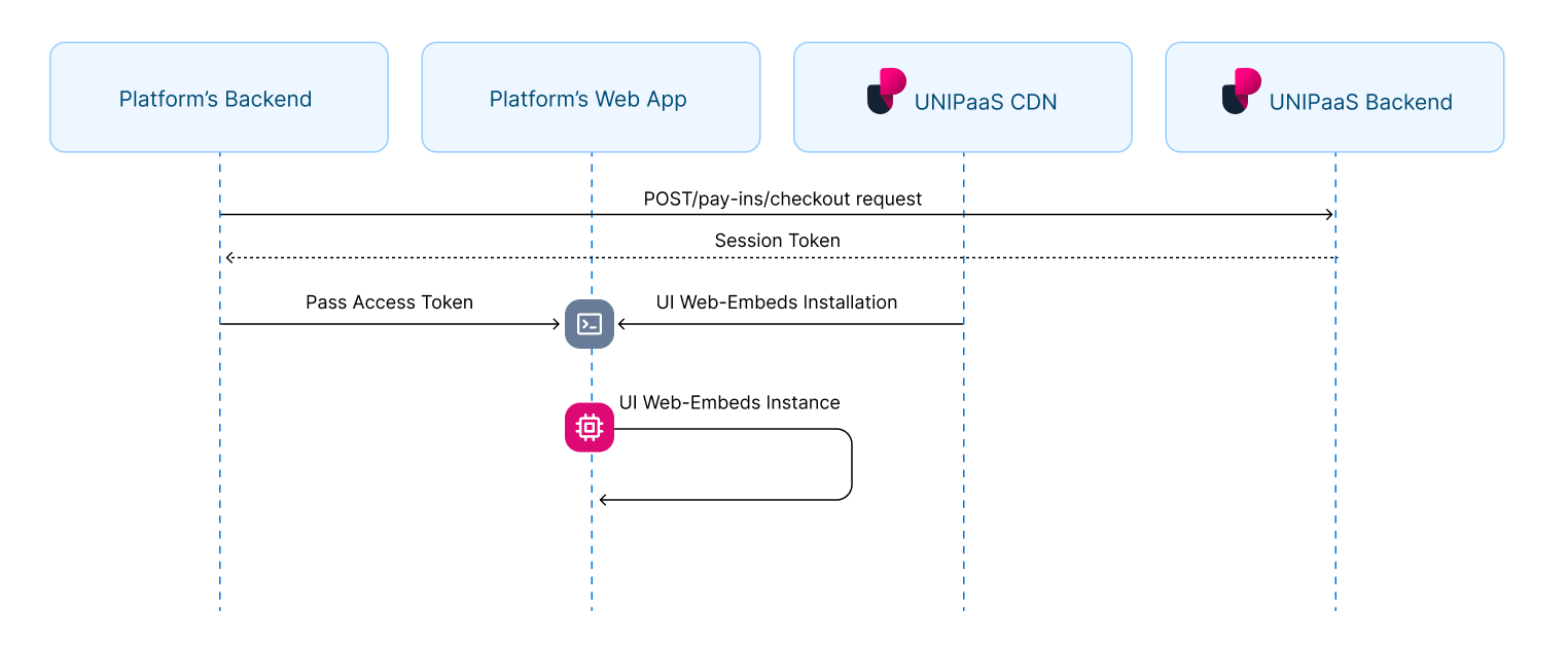
1. Authorization
In order to load the checkout UI Web-Embeds in your platform, an authorized API call is needed in your backend.
Generate an access token
To obtain an access token, you need first create a checkout using POST/pay-ins/checkout endpoint.
Learn more about payment creation
Below is an example of the JSON payload for creating a payment:
{
  "amount": 100,
  "currency": "GBP",
  "country": "GB",
  "vendorId": "66532df5d55926b2b12a874a",
  "email": "[email protected]",
  "reference": "Payment123",
  "description": "Payment for service",
  "consumer": {
    "name": "consumer.name",
    "reference": "CON-REF-123"
    }
}
In response to this API call, you will receive a session token along with other parameters:
"sessionToken": "eyJhbGciOiJIUzI1NiIsInR5cCI6IkpXVCJ9.eyJtZXJjaGFudElkIjoiNjEwNjZkYjA2MzBmNGUzNTlkYzA4NGU5IiwibWVyY2hhbnROYW1lIjoiQWxpY2UiLCJhbW91bnQiOjEwMCwiY3VycmVuY3kiOiJHQlAiLCJlbWFpbCI6InVzZXJAZXhhbXBsZS5jb20iLCJjb3VudHJ5IjoiR0IiLCJzZWxsZXJJZCI6IjY2NWVkMjEyZmNkZjBjZmVjM2M4N2UwMiIsInZlbmRvcklkIjoiNjY1ZWQyMTJmY2RmMGNmZWMzYzg3ZTAyIiwic2NvcGVzIjpbIndlYnNka19hY2Nlc3MiLCJkaXJlY3RfZGViaXRfcmVhZCJdLCJpc1JlY3VycmluZyI6ZmFsc2UsInBheW1lbnRMaW5rSWQiOiJMa1FUMTJnTC1VIiwiaWF0IjoxNzE4NjA0ODk3LCJleHAiOjE3MTg2MDY2OTd9.tfW5IUKOdes4Lb0g5laFCyFZzySzfwe0gHo6Ohi2pqI"This session token is necessary for loading the Checkout Page UI Web-Embed.
2. Installation
Script tag
Start with placing the following script tag element inside of the <head>of your HTML page:
<script type="application/javascript" src="https://cdn.unipaas.com/embedded-components.js"></script>This script tag loads the JavaScript code that provides the functionality for implementing UNIPaaS UI Web-Embeds on a webpage. When the script is loaded and executed, it will create an object in the memory that contains methods for instantiating and interacting with the UI Web-Embeds.
General configuration
Place the following script tag element below the closing <body> tag of your HTML page.
This script is used to initialize and configure UNIPaaS UI Web-Embeds on a web page.
<script type="text/javascript">
  const config_general = {
    theme: {
      type: 'dark',
      variables: {
        primaryBackgroundColor: '#121A2D',
        secondaryBackgroundColor: '#18233B',
        primaryTextColor: '#D8E2FB',
        secondaryTextColor: '#7A92B5',
        primaryButtonColor: '#2F80ED',
        primaryButtonLabelColor: '#FFFFFF',
        secondaryButtonColor: '#687B97',
        buttonBorderRadius: '3px',
        primaryInputBackgroundColor: '#18233B',
        primaryInputBorderColor: '#3C517B',
        primaryInputLabelColor: '#D8E2FB',
        inputBorderRadius: '4px',
        digitalWalletButtonMode: 'white',
      },
    },
  }
  const components = unipaas.components("<accessToken>", config_general);
</script>
Theme
The theme configuration allows you to customize the visual design of UNIPaaS UI Web-Embeds to match your product's branding. The theme comes with a set of pre-defined variables that are automatically applied based on the selected theme type, such as "dark" or "default". However, if you need to modify specific aspects of the theme, you can easily adjust these variables to suit your requirements.
Below is a table that explains each variable available for customization:
| Name | Type | Description |
|---|---|---|
theme.type | string | Specifies the theme type, such as "dark" or "default". |
primaryBackgroundColor | string | Defines the primary background color for the UI Web-Embeds. |
secondaryBackgroundColor | string | Sets the secondary background color for the UI Web-Embeds. |
primaryTextColor | string | Determines the color for primary text elements, including the checkout amount, vendor name, and payment method name. |
secondaryTextColor | string | Specifies the color for secondary text elements, including the reference number and save card for future payments. |
primaryButtonColor | string | Defines the color of the Pay button. |
primaryButtonLabelColor | string | Sets the label color on the Pay button. |
secondaryButtonColor | string | Determines the color of the Chevron for selecting the checkout language. |
buttonBorderRadius | string | Specifies the border radius of the payment button, influencing its roundness. |
primaryInputBackgroundColor | string | Defines the background color for input fields. |
primaryInputBorderColor | string | Specifies the border color for input fields. |
primaryInputLabelColor | string | Sets the label color for input fields. |
inputBorderRadius | string | Specifies the border radius for input fields, affecting their roundness. |
digitalWalletButtonMode | string | Determines the display mode for digital wallet buttons, such as "white" or "black". |
3. Implementation of the Embedded Checkout
Note!Please note that when mounting a component using a selector, the component should not be mounted more than once per selector. Mounting a component more than once can lead to unexpected behavior and issues.
To avoid this, make sure to check whether the component has already been mounted before calling the mount method.
Checkout Page UI Web-Embed
The Checkout Page will load with the payment methods configured for your platform and following your checkout creation process.
Allocate the minimal space for the Checkout Page UI Web Embed as follows:
Width - 360 pixels
Create a container
Place the following script tag element below the closing </body> tag of your HTML page.
Make sure to assign a unique ID to the container so that it can be easily identified and accessed.
<div id="checkout"></div>Create and mount an instance below the container
Create an instance of it and mount it to the container DOM node in your page. This should be done after the previous div has finished loading.
const checkout = components.create("checkout");
checkout.mount("#checkout");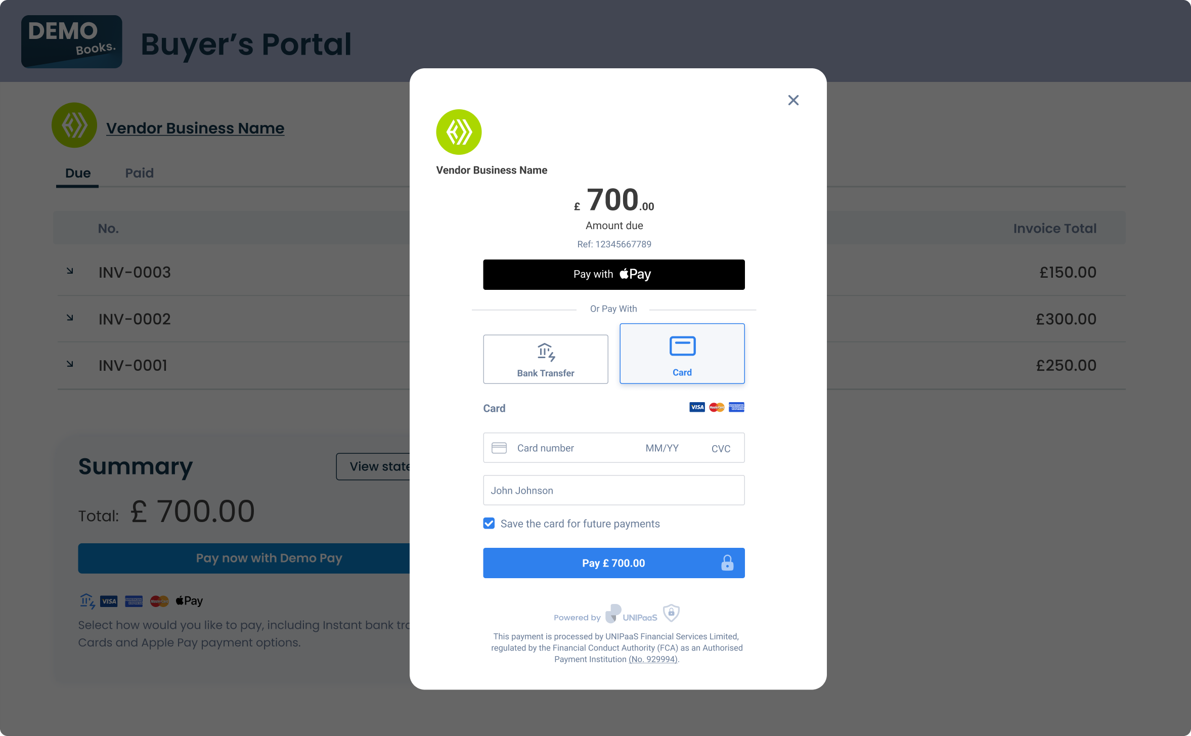
Example: The embedded checkout page is displayed in a modal window
Digital Wallet (Apple Pay / Google Pay) UI Web-Embed
The Digital Wallet UI Web Embed will intelligently load the appropriate payment method, either Apple Pay or Google Pay, or none of them.

Apple Pay and Google Pay are never displayed together due to OS restrictions. Apple Pay is exclusive to Apple devices with Apple Wallet installed, while Google Pay is designed for Android devices and operates through the Google Pay app.
| Browser and wallet | Button displayed |
|---|---|
| Safari + Apple Pay enabled | Apple Pay |
| Chrome on iOS 16 + Apple Pay enabled | Apple Pay |
| Any browser on Android + Google Pay enabled | Google Pay |
| Any browser + No active Apple Pay or Google Pay | No button displayed |
Allocate the minimal space for the Digital Wallet UI Web-Embed as follows:
Width - 150 pixels
Create a container
Place the following script tag element below the closing </body> tag of your HTML page.
Make sure to assign a unique ID to the container so that it can be easily identified and accessed.
<div id="digital_wallet"></div>Create and mount an instance below the container
Create an instance of it and mount it to the container DOM node in your page. This should be done after the previous div has finished loading.
const digitalWallet = components.create("digitalWallet");
digitalWallet.mount("#digital_wallet");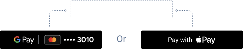
Card UI Web-Embed
The Card UI Web-Embed includes two input fields for entering card details and cardholder name, a checkbox for saving the card (supporting card tokenization for returning customers), and a payment button to complete the transaction.
Allocate the minimal space for the Card UI Web Embed as follows:
Width - 340 pixels
Create a container
Place the following script tag element below the closing </body> tag of your HTML page.
Make sure to assign a unique ID to the container so that it can be easily identified and accessed.
<div id="card"></div>Create and mount an instance below the container
Create an instance of it and mount it to the container DOM node in your page. This should be done after the previous div has finished loading.
const card = components.create("card");
cards.mount("#card");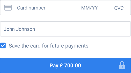
Payment Method Selection UI Web-Embed
The Payment Method Selection UI Web-Embed will load with the payment methods configured for your platform and according to your checkout creation process, including relevant payment buttons to support various payment flows. However, this embed does not support displaying Apple Pay and Google Pay payment methods.
Allocate the minimal space for the Payment Method Selection UI Web-Embedas follows:
Width - 340 pixels
Create a container
Place the following script tag element below the closing </body> tag of your HTML page.
Make sure to assign a unique ID to the container so that it can be easily identified and accessed.
<div id="payment_methods_selection"></div>Create and mount an instance below the container
Create an instance of it and mount it to the container DOM node in your page. This should be done after the previous div has finished loading.
const paymentMethodsSelection = components.create("paymentMethodsSelection");
paymentMethodsSelection.mount("#payment_methods_selection");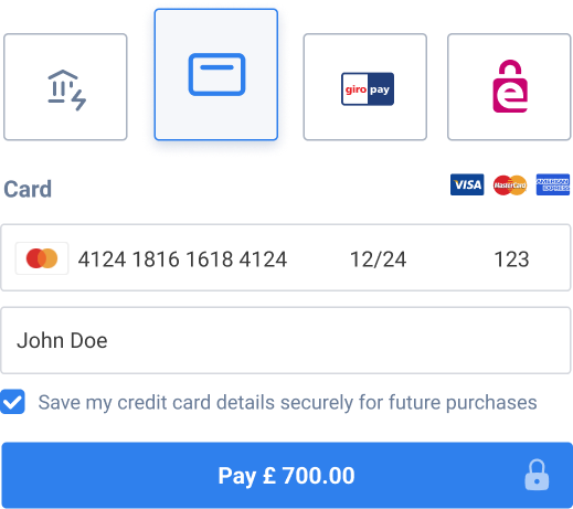
Example: 4 payment methods are available in a single embed, including Cards, Instant bank transfer, GiroPay and EPS
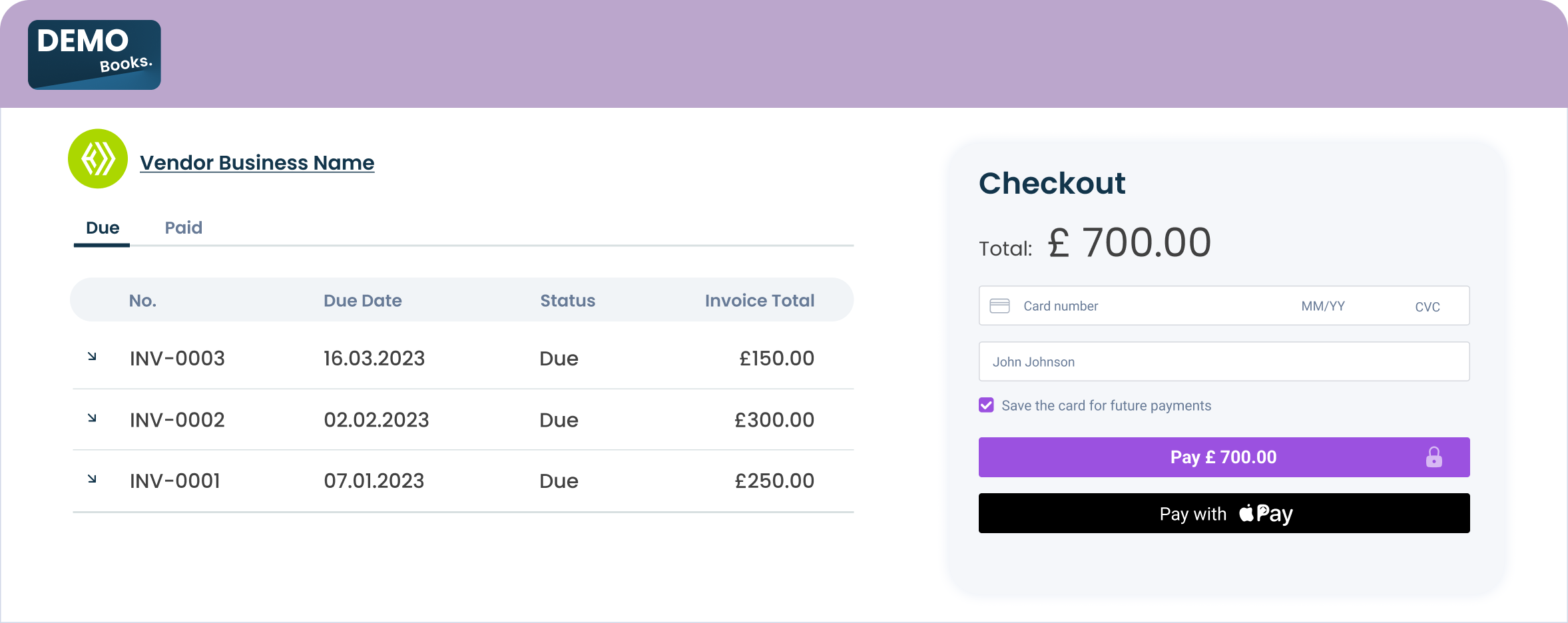
Example: Card embed and Digital wallet embed are implemented on the platform's checkout page
4. DOM EventListeners
The UI web-embeds generate DOM events to provide real-time updates on user activity and checkout status.
These events can be used to trigger custom actions and ensure a seamless user experience at platform's end.
Create DOM event listeners
Place the following script tag element at the very bottom, below the closing </body> tag of your HTML page.
components.on("paymentSuccess", (e) => {
    console.log("paymentSuccess", e.detail);
});
components.on("paymentError", (e) => {
    console.log("paymentError", e.detail);
});
components.on("paymentSubmission", (e) => {
    console.log("paymentSubmission", e.detail);
});
components.on("paymentCancel", (e) => {
    console.log("paymentCancel", e.detail);
});
Handle DOM events
| Event | Description | Action |
|---|---|---|
paymentSuccess | This event is triggered when a user successfully completes a transaction. It provides real-time information to the platform, indicating that the payment has been successfully processed. | Display the updated post-payment view |
paymentCancel | This event is triggered when a user cancels a payment. | A relevant experience tailored to the platform can be created. |
paymentError | This event is triggered when an error occurs during the payment. | A relevant experience tailored to the platform can be created. |
paymentSubmission | This event is triggered when the user attempts to make a payment by pressing the payment button. | A relevant experience tailored to the platform can be created. |
Updated 7 months ago