
Buyer UI: Implementation Guide
UI Web-Embeds offer an efficient and user-friendly way to integrate various functionalities into a web application, without requiring extensive coding effort. By implementing pre-built embeds directly into your platform's UI, you can save development time and resources, while also ensuring a consistent user experience across your platform thanks to customisation options.
Steps
- Installation
- Authorization
- Implementation
- Pay Button
- DOM EventListeners
{`
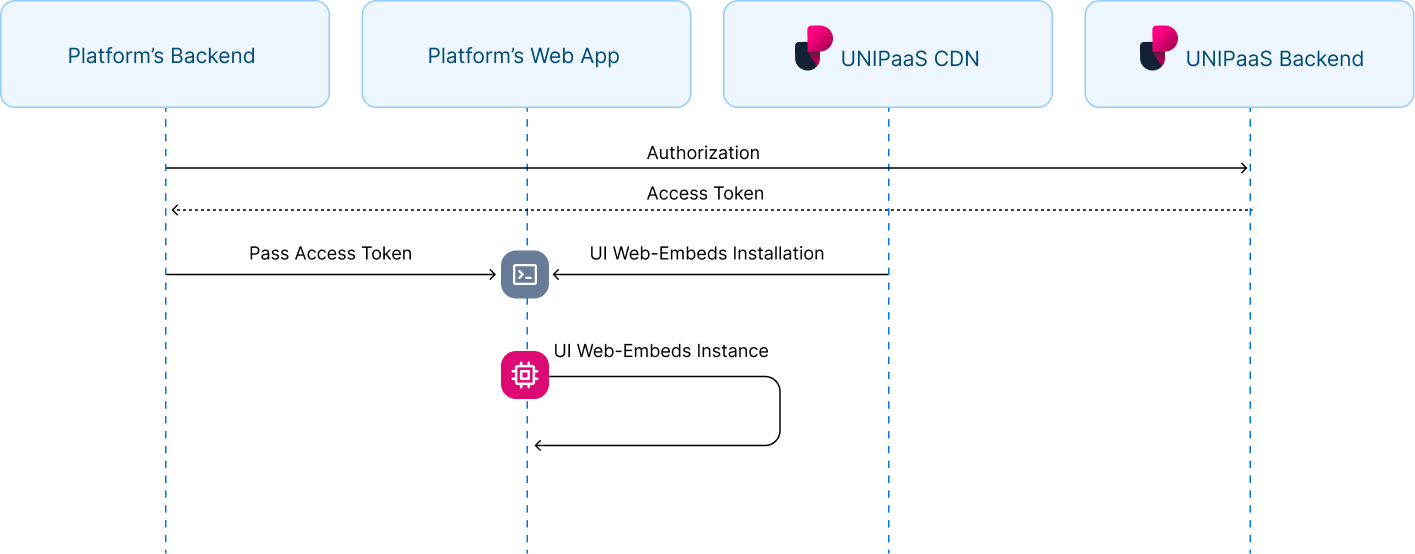
1. Installation
`}
In order to import UI Web-Embeds, start with placing the following {`
This script tag loads the JavaScript code that provides the functionality for implementing UNIPaaS UI Web-Embeds on a webpage. When the script is loaded and executed, it will create an object in the memory that contains methods for instantiating and interacting with the UI Web-Embeds.

Place the following script tag element below the closing `</body>` tag of your HTML page.\
This script is used to initialize and configure UNIPaaS UI Web-Embeds on a web page.

```html
<script type="text/javascript">
    const components = unipaas.components("<accessToken>");
</script>
{`
2. Authorization
`}
In order to load UI Web-Embeds in your platform, an authorized API call is needed in your backend with defined scopes and a vendor ID (if applicable) to generate the UNIPaaS access token.
Obtain access token
`curl -X POST "https://sandbox.unipaas.com/platform/authorize"
2  -H  "accept: application/json"
3  -H  "Authorization: Bearer <PLATFORM_SECRET_KEY>"
4  -H  "Content-Type: application/json"
5  --data-raw '{
6      "scopes": ["portal_read","portal_write","onboarding_write"],
7      "vendorId": "{vendorId}"
8   }'`
  <td>
    `POST`
  </td>
</tr>

<tr>
  <td>
    Environment
  </td>

  <td>
    `sandbox`
  </td>
</tr>

<tr>
  <td>
    URL
  </td>

  <td>
    `https://sandbox.unipaas.com/platform/authorize`

    In order to switch to production environment, please use the following`https://api.unipaas.com/platform/authorize` URL and the appropriate secret key
  </td>
</tr>
|
|---|
| Verb |
  <th>
    Type
  </th>

  <th>
    Required
  </th>

  <th>
    Description
  </th>
</tr>
  <td>
    string
  </td>

  <td>
    YES
  </td>

  <td>
    The scopes `portal_read` , `portal_write`included in this API request example, determine the level of access required to perform specific actions, similar to `GET` and `POST` methods
  </td>
</tr>

<tr>
  <td>
    `vendorId`
  </td>

  <td>
    string
  </td>

  <td>
    YES
  </td>

  <td>
    A vendor ID is a unique identifier for the vendor requesting API access.\
    You can obtain a vendor ID when [you create a vendor on your platform](https://docs.unipaas.com/docs/create-vendor)
  </td>
</tr>
| Name |
|---|
| `scopes` |
Response example
{
  "accessToken": "eyJhbGciOiJIUzI1NiIsInR5cCI6IkpXVCJ9.eyJzY29wZXMiOlsib25ib2FyZGluZ193cml0ZSIsInBheW91dF93cml0ZSIsImxpbmtfd3JpdGUiLCJvbmJvYXJkaW5nX3dyaXRlIiwibm90aWZpY2F0aW9uX3dyaXRlIiwiY29uZmlnX3JlYWQiLCJkaXJlY3RfZGViaXRfd3JpdGUiLCJld2FsbGV0X3JlYWQiLCJwdWJsaWNfY29uZmlnX3JlYWQiLCJsaW5rX3JlYWQiLCJvbmJvYXJkaW5nX3JlYWQiLCJub3RpZmljYXRpb25fcmVhZCIsImNvbmZpZ19yZWFkIl0sInZlbmRvcklkIjoiNjNkN2E2Njk4NGFkZDc5YWU2YmFmZDg3IiwibWVyY2hhbnRJZCI6IjYxZTZlOTdmZjEyNDJiODIwYzlkNWM4MSIsImVudiI6ImRldiIsImlhdCI6MTY4MTg1MTQ5MCwiZXhwIjoxNjgxODUzMjkwfQ.q5dCR3zfuEWCTG8HdvfEtlY7BmHxvJL0PFinlJSe8uQ",
  "expiresIn": 3600,
    "scopes": [
    "portal_read",
    "portal_write",
  ],
  "vendorId": "63d7a66984add79ae6bafd87",
  "merchantId": "61e6e97ff1242b820c9d5c81",
  "env": "sandbox"
}
| Name | Type | Description |
|---|---|---|
accessToken | string | Access token for the UI Web-Embeds |
expiresIn | string | Time until the access token expires (in seconds) |
scopes | string | List of permissions granted for the access token |
vendorId | string | Unique identifier for the vendor requesting access |
merchantId | string | Unique identifier for the platform associated with the vendor |
env | string | The environment in which the access token was issued |
This access token is valid for one hour, and it will be automatically refreshed whenever a UI Web-Embed communicates with the UNIPaaS servers.
Scopes
| Name | Description |
|---|---|
portal_read | Grants all GET permissions required for using UI Web-Embeds on your platform |
portal_write | Grants all POST permissions required for using UI Web-Embeds on your platform |
{`
3. Implementation
`}
To gain more knowledge of the UI Web-Embeds logic and identify the appropriate location for implementing them within your platform, please refer to the UI Web-Embeds overview.
Note!
Please note that when mounting a component using a selector, the component should not be mounted more than once per selector. Mounting a component more than once can lead to unexpected behavior and issues.
To avoid this, make sure to check whether the component has already been mounted before calling the mount method.
Pay Button
Create a container
Place the following script tag element below the closing </body> tag of your HTML page.
Make sure to assign a unique ID to the container so that it can be easily identified and accessed.
<div id="paymentButton"></div>
Create and mount an instance below the container
Create an instance of it and mount it to the container DOM node in your page. This should be done after the previous div has finished loading.
<script type="text/javascript">
  //An example of the checkoutHandler function
  async function checkoutHandler() {
  	const data = {
      invoiceId: "INV-0001",
    }
    const checkout = await fetch("https://yourplatformurl.com/checkout", {
      method: "POST",
      headers: {
      	"Content-Type": "application/json"
    	},
			body: JSON.stringify(data)
    })
    return checkout;
  }
  const config = {
    checkoutHandler,
    theme: {
      colors: {
		    primaryButtonColor: "#2f80ed",
      }
    },
    backdrop: true,
    payButton: {
    textColor: "#fffffff",
    // or,
    className: "unipaas-btn-payment",
    text: "Pay now",
    disableRipple: false,
    icon: {
         url: "https://yourplatformurl.com/icon.svg",
         left: true,
         right: false,
         size: 18
        }
    }
};
  const paymentButton = components.create("paymentButton", config);
  paymentButton.mount("#paymentButton");
</script>
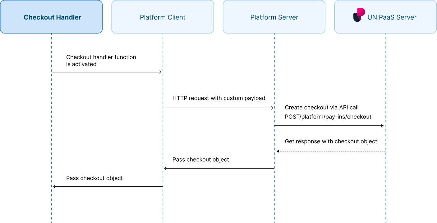
Checkout handler
checkoutHandler is a required method that must be implemented by the platform. Its purpose is to retrieve the identifying parameters and data associated with each generated Pay Button UI Web-Embed. Subsequently, the function will initiate a request to your backend system in order to create a checkout.
Before the checkout creation process occurs, it is essential to conduct validation on your end to ensure that all data received from the client is legitimate. The final step involves establishing the checkout by making a server-to-server request (from your server to the UNIPaas server).
It is expected that the checkout handler function will provide the return value of the UNIPaas checkout request form, which will be identical to the response received by your backend.
Appearance and configuration
The Pay button UI Web Embed offers both basic and advanced CSS configurations. Platform has the option to employ a pre-defined class, allowing it to override the default settings entirely, including pseudo classes: hover, click. Alternatively, platform can customize specific aspects of the basic button parameters, such as the button color, text color, and ripple effect.
In the absence of using a predefined class, the default button dimensions will adhere to the following specifications:
Width - 100% of the container
Height - based on the font size, with an additional 5 pixels of padding included
  <th>
    Type
  </th>

  <th>
    Description
  </th>
</tr>
  <td>
    method
  </td>

  <td>
    [Checkout handler description](https://docs.unipaas.com/docs/ui-web-embeds-implementation-buyer#checkout-handler)
  </td>
</tr>

<tr>
  <td>
    `theme.colors.primaryButtonColor`
  </td>

  <td>
    string
  </td>

  <td>
    Represents the color of the primary button

    If you are utilizing a custom class for styling purposes, you should not utilize the `colors.primaryButtonColor` parameter. Instead, you can define the button color directly within your custom CSS class, overriding any default settings
  </td>
</tr>

<tr>
  <td>
    `backdrop`
  </td>

  <td>
    boolean
  </td>

  <td>
    Indicates whether the background darkening overlay is active when the checkout window is open as an overlay. When set
  </td>
</tr>

<tr>
  <td>
    `payButton.className`
  </td>

  <td>
    string
  </td>

  <td>
    Represents the CSS class name associated with the pay button for custom styling
  </td>
</tr>

<tr>
  <td>
    `payButton.textColor`
  </td>

  <td>
    string
  </td>

  <td>
    Represents the color of the text within the pay button

    If you are utilizing a custom class for styling purposes, you should not utilize the colors.primaryButtonColor parameter. Instead, you can define the button color directly within your custom CSS class, overriding any default settings
  </td>
</tr>

<tr>
  <td>
    `payButton.disableRipple`
  </td>

  <td>
    boolean
  </td>

  <td>
    Indicates whether the ripple effect on the Pay button should be enabled/disabled
  </td>
</tr>

<tr>
  <td>
    `payButton.text`
  </td>

  <td>
    string
  </td>

  <td>
    Represents the text content of the Pay Button
  </td>
</tr>

<tr>
  <td>
    `payButton.icon.url`
  </td>

  <td>
    string
  </td>

  <td>
    Represents the URL of the icon for the Pay Button

    By providing a valid URL, you can incorporate a custom icon or image to enhance the visual representation of the Pay Button in the user interface
  </td>
</tr>

<tr>
  <td>
    `payButton.icon.left`
  </td>

  <td>
    boolean
  </td>

  <td>
    Indicates whether the icon is positioned on the left side of the Pay Button
  </td>
</tr>

<tr>
  <td>
    `payButton.icon.right`
  </td>

  <td>
    boolean
  </td>

  <td>
    Indicates whether the icon is positioned on the right side of the Pay Button
  </td>
</tr>

<tr>
  <td>
    `payButton.icon.size`
  </td>

  <td>
    string
  </td>

  <td>
    Represents the size of the square icon in pixels (px)
  </td>
</tr>
| Name |
|---|
| `checkoutHandler` |
{`
4. DOM Event Listeners
`}
The UI web-embeds generate DOM events to provide real-time updates on user activity within each UI Web-Embed. These events can be used to trigger custom actions and ensure a seamless user experience at platform's end.
Create DOM event listeners
Place the following script tag element at the very bottom, below the closing </body> tag of your HTML page.
components.on("checkoutOpen", (e) => {
  console.log("checkoutOpen event", e.detail);
});
components.on("checkoutSuccess", (e) => {
  console.log("checkoutSuccess event", e.detail);
});
components.on("checkoutClose", (e) => {
  console.log("checkoutClose event", e.detail);
});
Handle DOM events
| Event | Description | Action |
|---|---|---|
checkoutOpen | This event is triggered when a user clicks on the Pay Button and a checkout page is opened. This event provides real-time information to the platform, indicating that the user has initiated the checkout process | None |
checkoutSuccess | This event is triggered when a user completes a transaction and it is successful. This event provides real-time information to the platform, indicating that a payment has been successfully processed | Display the updated post-payment view |
checkoutClose | This event is triggered when a user closes the checkout page, or when the checkout page is automatically closed after a successful transaction | None |
Updated 6 months ago